
Key Takeaways
- Effective progress indicators enhance user experience by providing clear feedback during wait times.
- Understanding the psychology behind user engagement can inform better design choices.
- Implementing best practices in progress indicator design can reduce user frustration and abandonment rates.
Understanding the Role of Progress Indicators
Progress indicators are crucial user interface elements designed to convey the status of ongoing operations, such as loading web pages or processing uploads. They serve as powerful communication tools that set user expectations and minimize uncertainty during periods of inactivity or delay. By providing visible feedback, progress indicators contribute to a smoother, less frustrating experience. Explore a wide variety of UI progress indicator examples and designs to inspire your next project.
These visual cues play an integral role in digital environments where instant gratification is often the norm. Without timely progress updates, users may become anxious, impatient, and more likely to abandon a process altogether. Research shows that clear feedback during waiting periods is a crucial factor in maintaining positive user perception and loyalty.
Designers and developers must recognize that users crave clarity. The uncertainty of not knowing how long a task will take can significantly amplify negative feelings. That is why organizations prioritize investing in thoughtfully designed indicators, especially in high-traffic applications and services.
Beyond functional utility, progress indicators also support branding and trust. An elegantly animated progress bar or spinner reassures users that the system is operational and attentive to their needs, even during inevitable delays.
The Psychology Behind User Engagement
The science of user engagement reveals why progress indicators matter. The goal-gradient effect, a psychological principle, highlights that individuals become more motivated as they see visible progress toward a goal. When users see a filling progress bar or a ticking percentage, they subconsciously accelerate their efforts and remain invested until completion. Learn more about the psychology of motivation from Psychology Today.
Progress indicators also cater to the human desire for closure. Clear stages or checkpoints break complex tasks into manageable steps, making challenges feel more approachable. As a result, users move confidently from one step to the next, reducing drop-off rates and boosting satisfaction.
Types of Progress Indicators
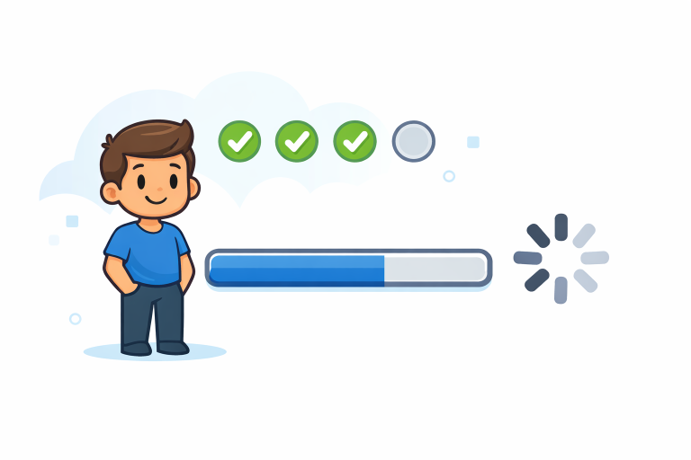
- Determinate Indicators: These show precise progress toward task completion, typically as percentages or increments. For example, software installations that display “45% complete” keep users informed about exactly where they stand in the process.
- Indeterminate Indicators: These indicate that a process is ongoing without specifying a completion time. Animated spinners or pulsing loaders serve this purpose when the system cannot predict how long an operation will take.
Best Practices for Designing Progress Indicators
- Provide Clear Feedback: Users must always know what is happening. Whether it’s a step-by-step progress bar or an animated loading spinner, the indicator should align with the actual process and accurately set timing expectations.
- Maintain Consistency: Progress indicators should look and behave similarly across comparable parts of your product. A consistent visual language prevents confusion and improves usability.
- Incorporate Animation: Carefully crafted animation can ensure a system is working properly. For example, a gentle pulsing effect or a moving bar signals that processes are not stalled.
- Use Micro-Interactions: Tiny design details, such as a quick color change or subtle movement, can turn functional elements into engaging experiences. Read more about the power of micro-interactions for enhanced user engagement in this Smashing Magazine article.
Common Pitfalls to Avoid
- Misleading Indicators: Do not display progress bars that jump abruptly or poorly reflect the actual process. Inaccurate visuals erode trust and increase frustration.
- Overloading Information: Avoid crowding the indicator with unnecessary details. Present only the information relevant to the specific stage, keeping the interface clean and the process clear.
- Ignoring Context: Tailor progress indicators to match the process and platform. For example, a long-form survey benefits from a segmented progress bar, while a quick upload may only need a spinning wheel.
Real-World Examples
Many industry-leading applications showcase outstanding use of progress indicators. Fitness platforms use daily goal-tracking bars to motivate users to walk more steps or complete more exercises, reflecting the incremental approach detailed in behavioral science. Similarly, major e-commerce websites use step-tracking progress bars during the checkout process to orient shoppers and reduce cart abandonment. For instance, Amazon’s order tracker highlights each phase, from “Order Placed” to “Delivered,” helping manage customer expectations.
In productivity tools like project management software, task lists use percentages or color-changing indicators to highlight progress, nudging users toward completion. Streaming services, such as Netflix, use loading animations and progress circles during buffering, reassuring viewers that playback will resume shortly. Explore the latest research and practical examples on progress indicator performance in this Nielsen Norman Group report.
Conclusion
Progress indicators are indispensable for creating smooth digital journeys. By applying psychological insights and adhering to proven design principles, product teams can guide users through any waiting period or complex task with ease. Well-designed indicators not only reduce abandonment and frustration but can also build confidence and foster brand trust. The next time you create or update a digital experience, remember the powerful impact of a thoughtfully crafted progress indicator.